박스 모델 테두리에 이미지를 넣기 위해서는 사용할 이미지를 지정하고, 그 이미지를 필요한만큼 쪼개서 가져와야 합니다. 여기서 중요한 것은 원본 이미지를 어떻게 나눌까, 하는 것입니다.
관련된 속성을 하나씩 살펴보면서 어떻게 적용되는지 살펴보죠.
border-images-source 속성
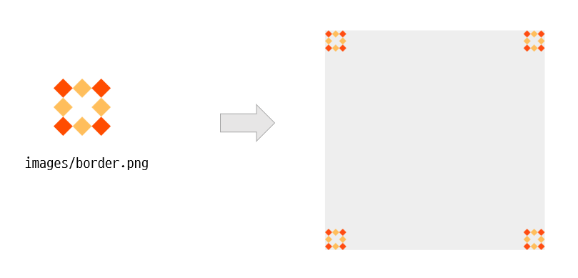
박스 모델 테두리에 어떤 이미지를 넣을지 지정합니다. 만일 테두리 이미지를 가져오지 못할 경우를 대비해서 일반적인 테두리 스타일도 작성해야 합니다. 기본값은 none입니다.
.box {
   width:300px;
   height: 300px;
   background-color: #eee;
   border: 36px solid orange;
   border-image-source : url('images/border.png’);
}
border-image-slice 속성
이제 원본 이미지를 쪼개서 박스 모델에 적용시켜 보겠습니다.
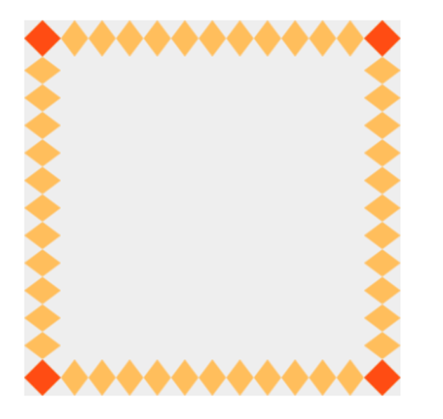
border-image-slice 속성을 사용해서 이미지 원본을 9개 영역으로 나눕니다. top과 right, bottom, left 모서리를 기준으로 얼마나 떨어져 있는 크기를 지정합니다.
기본값은 100%입니다.
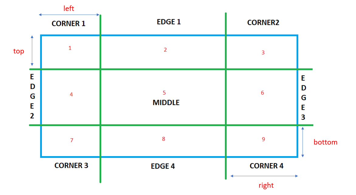
원본 이미지를 쪼개서 만들어진 corner1과 corner2, corner3, corner4는 박스 모델의 4군데 꼭지점에 고정되고, edge1, edge2, edge3, edge4는 박스 모델의 4군데 모서리에 배치됩니다. 채워넣어야 할 영역이 클 경우 테두리 이미지는 자동으로 늘어납니다.
우리가 사용할 이미지는 가로, 세로 각각 81픽셀짜리 이미지입니다. 그래서 오프셋 거리를 27픽셀씩 지정하면 됩니다.

앞에서 작성한 CSS 소스에 다음과 같이 추가합니다. 단, 자를 크기 뒤에는 단위를 붙이지 않습니다.
.box {
width:300px;
height: 300px;
background-color: #eee;
border: 36px solid orange;
border-image-source : url('images/border.png’);
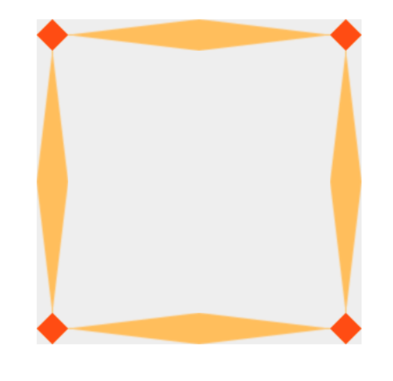
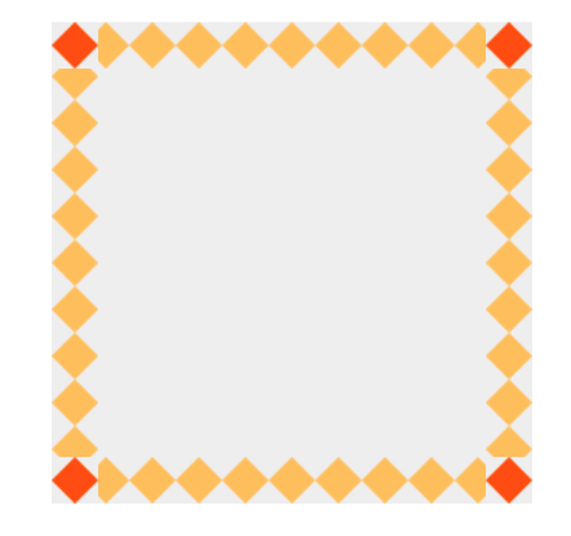
border-image-slice: 27;
}결과는 다음과 같이 나타날 것입니다.
border-image-repeat 속성
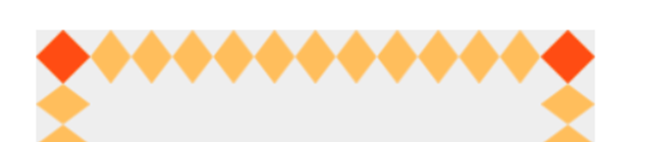
앞의 결과를 보면 모서리 부분에는 edge1~edge4가 한번씩만 표시되기 때문에 영역을 채울만큼 이미지가 늘어납니다. border-image-repeat 속성을 사용하면 테두리 이미지를 어떻게 반복시킬지 지정할 수 있습니다.
앞의 CSS 속성에 border-image-repeat 속성을 추가해 볼까요?
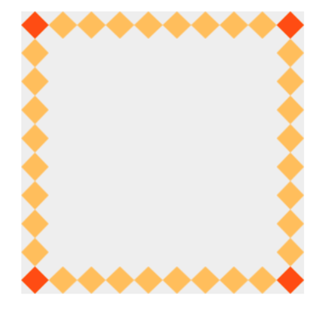
1) border-image-repeat: repeat
.box {
   width:300px;
   height: 300px;
   background-color: #eee;
   border: 36px solid orange;
   border-image-source : url('images/border.png’);
   border-image-slice: 27;
   border-image-repeat: repeat;
}
2) border-image-repeat: round
.box {
   width:300px;
   height: 300px;
   background-color: #eee;
   border: 36px solid orange;
   border-image-source : url('images/border.png’);
   border-image-slice: 27;
   border-image-repeat: round;
}
3) border-image-repeat: space
.box {
   width:300px;
   height: 300px;
   background-color: #eee;
   border: 36px solid orange;
   border-image-source : url('images/border.png’);
   border-image-slice: 27;
   border-image-repeat: space;
}
border-image-width 속성
잘라낸 이미지를 테두리에 채워넣을때 너빗값을 얼마로 할지 지정합니다. 값은 1개부터 4개까지 가능하고, px뿐만 아니라 em이나 % 등 크기와 관련된 다양한 단위를 사용할 수 있습니다. 기본값은 1입니다.
원본 이미지에서 잘라낸 크기만큼 표시할 때
.box {
   width:300px;
   height: 300px;
   background-color: #eee;
   border: 36px solid orange;
   border-image-source : url('images/border.png’);
   border-image-slice: 27;
   border-image-repeat: round;
   border-image-width: 27px;
}
박스 모델의 테두리 너비만큼 표시할 때
.box {
   width:300px;
   height: 300px;
   background-color: #eee;
   border: 36px solid orange;
   border-image-source : url('images/border.png’);
   border-image-slice: 27;
   border-image-repeat: round;
   border-image-width: 36px;
}
박스 모델의 테두리 너비보다 크게 표시할 때
이 경우에는 내용 영역을 침범해서 테두리 이미지가 그려집니다.
.box {
   width:300px;
   height: 300px;
   background-color: #eee;
   border: 36px solid orange;
   border-image-source : url('images/border.png’);
   border-image-slice: 27;
   border-image-repeat: round;
   border-image-width: 50px;
}
border-image-outset 속성
박스 모델에 테두리 이미지를 표시할 때 박스 영역 바깥에 표시할 수도 있습니다. 기본값은 0입니다.
.box {
   width:300px;
   height: 300px;
   background-color: #eee;
   border: 36px solid orange;
   border-image-source : url('images/border.png’);
   border-image-slice: 27;
   border-image-repeat: round;
   border-image-width: 27px;
   border-image-outset: 27px;
}
border-image 속성
앞에서 설명한 모든 속성을 border-image 속성으로 줄여쓸 수 있습니다.
단, image-slice와 image-width, image-outset이 모두 숫자이기 때문에 /를 사용해 숫자 값을 구별합니다.
border-image 속성에서 빠진 속성은 기본값을 사용합니다.
border-image: [border-image-source] [border-image-slice] / [border-image-width] / [border-image-outset] [border-image-repeat]
.box {
   width:300px;
   height: 300px;
   background-color: #eee;
   border: 36px solid orange;
   border-image : url('images/border.png’) 27 / 27px / 27px round;
}
border-image 제너레이터
박스 모델 테두리에 이미지를 넣는 과정이 꽤 복잡하기 때문에 이 과정을 쉽게 처리할 수 있는 제너레이터도 많이 공개되어 있습니다. 검색해 보면 여러 가지 제너레이터가 있겟지만 여기에서는 MDN에서 제공하는 Border-image generator를 소개합니다.
https://developer.mozilla.org/en-US/docs/Web/CSS/CSS_Backgrounds_and_Borders/Border-image_generator
Border-image generator - CSS: Cascading Style Sheets | MDN
This tool can be used to generate CSS border-image values.
developer.mozilla.org

'css' 카테고리의 다른 글
| 계산식을 사용하는 CSS 함수 - calc() (0) | 2023.02.22 |
|---|---|
| 좌우로 왔다갔다 하는 CSS 애니메이션 (0) | 2023.02.15 |
| 텍스트 안에 배경 이미지 넣기 (0) | 2022.05.19 |
| css 단위 - 길이 (0) | 2022.04.08 |
| 가상 요소 ::before, ::after (0) | 2022.03.07 |


